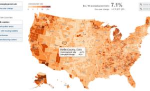
 Maps can show the scope of a story in a way that words and pictures alone cannot. The New York Times has produced a simple map that shows the impact of unemployment across the country, county-by-county. Roll-over boxes show how the unemployment rate has changed from a year ago.
As the caption notes and the map makes clear, “Job losses have been most severe in the areas that experienced a big boom in housing, those that depend on manufacturing and those that already had the highest unemployment rates.”
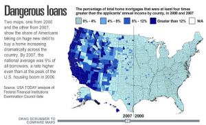
 USA Today combines a map of home loans with a timeline “scrubber” that lets users compare data from 2000 and 2007. It’s a dramatic illustration of the huge increase over that time period in mortgages that were four times greater than the applicant’s annual income.
CNN has a series of maps that make the state-by-state impact of the recession easy to grasp at a glance, showing unemployment, state budget deficits and foreclosures.
![]() Embedded in the maps are personal stories, like that of Fai Nomaaea [left], who lost her rented home when the owner defaulted on the mortgage. Additional maps show the estimated effect of the federal stimulus bill on jobs in each state. It’s a great example of a “sticky” site giving users a lot to explore.
Embedded in the maps are personal stories, like that of Fai Nomaaea [left], who lost her rented home when the owner defaulted on the mortgage. Additional maps show the estimated effect of the federal stimulus bill on jobs in each state. It’s a great example of a “sticky” site giving users a lot to explore.
Please let us know if you’ve produced or seen other recession-related maps so we can share more good examples.


1 comment for “Mapping the recession”